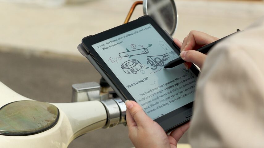
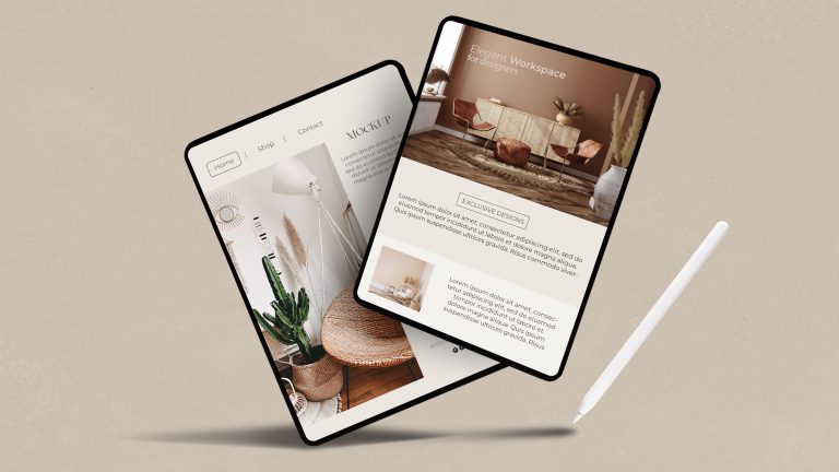
Over the years, eBooks have gained massive popularity, and their sales have skyrocketed. It is the best time to publish your first eBook, but you need some things. Number one is premium content and good writing skills. Given that you have that sorted, another thing that is underrated but equally important when making an eBook is its design. You must be sure that you format the book professionally and that people are intrigued to download and read it. Creative photos, designs, and layouts, created with the help of VistaCreate, are a great way to increase the demand and downloads of your eBook. Today, we will look at some tips to create the best eBook design.
#1 – Outline Each Chapter

Formatting is very important, and one of the first things people see when they open your book is how it looks. Your book should have chapters and maybe even subchapters, which should be shown in a lovely Table of Contents at the beginning.
Don’t try to fill up pages; if you can say something in 10 pages, don’t write 30. It doesn’t matter how long an eBook is as long as it is formatted well. You should also be careful about what you call the chapters, since this will grab the reader’s attention.
Boring names, however, would probably make the reader less interested. You can always try to make a pun, but it’s better to keep things serious and get to the point.
#2 – An Eye-Catching Front Cover
The saying, “Never judge a book by its cover,” may be true, but when it comes to an eBook, appearance and graphics matter a lot. Therefore, you must decide on a very creative yet minimalistic front cover. It should be catchy to grab the user’s attention, and the best way to do that is to use a photo on the front cover.
A striking, bold photo will do wonders for your eBook, and you will be amazed to see the difference in results once you have an eye-catching front cover.
Selecting the perfect photo can be daunting, but you can create some graphics or take photos. You will also have to resize your image to the perfect size so it takes up the majority of the space on the cover.
#3 – Have Variable Font Sizes

Font sizes are just as important as the font you choose. You should use different font sizes for the main paragraph, the headings, and the subheadings. The pattern should be used throughout the book because it creates balance and makes it easier for people to understand what is being said.
When everything in a book is written in the same font, it’s hard to read. Most people would give up on it after the first page or even less. Choose a typeface that is easy to read in both small and large sizes. A serif typeface like Times New Roman or Garamond is always a safe choice since they provide great legibility even in smaller sizes.
Additionally, use fonts with larger x-heights so there’s enough contrast between characters, making them easier to read onscreen.
Finally, test out different font weights and styles (e.g., italics) to add more visual interest and make your eBook stand out from other titles in the marketplace.
Here’s what a good eBook font design should look like:
#4- Add Custom Visuals and Graphics
Adding stock images or even your own photography to your eBook is great, but what really stands out are the animations and custom graphics. You can go for vectors or other graphic designs that accentuate your book. Infographics are the best way to convey information, and you should use several charts and diagrams of your own.
People tend to read books with more graphics, as they convey a better story and are less boring to read. Not to forget, a chart or graph can display information worth a thousand words!
#5 – Go With The Best Colors

Your eBook must follow a specific color palette that your brand logo or story would contain. Remember that you do not have to go too bold with the colors; light colors are much better suited throughout. You can go bold on the title, but the book’s overall theme is better with light pastel colors.
You should also follow the colors of your logo, and your charts and animations must also be based on your logo’s primary or secondary color to add a touch of personalization. Remember, uniqueness is the number one priority when designing an eBook.
#6 – Interactivity & Navigation
Creating the best eBook design is an art form in itself. It requires careful consideration of interactivity and navigation to make sure readers have a satisfying experience while they read. To create the best eBook, there are certain steps authors should follow.
First, consider interactivity when creating your eBook design. Aim to create engaging content that encourages readers to stay engaged throughout the entire book. Features like audio and video clips can enhance reader experiences and can give them an immersive feeling. Adding interactive elements such as quizzes and polls can also encourage readers to explore different aspects of your book’s content further.
Second, think about how you want people to navigate through your book when creating the best eBook design. Make sure the flow of information makes sense so that readers don’t feel overwhelmed or confused by it. Navigation should provide easy access to every page in the book, so readers know exactly where they are at any given moment without feeling lost in the material. Chapters should be labeled clearly and concisely, such as “Chapter 1: Introduction” or “Chapter 2: The History of Writing”; this allows readers to quickly recognize where they are in the book and what topic is being discussed.
Conclusion
Creating an ebook design that stands out from the rest is a process that requires careful consideration and attention to detail. The content of an ebook is very important, but it’s difficult for the audience to stick to your book if it does not have the right design and graphics. High-quality content needs to be backed up by a design that looks good and is consistent: cool colors, eye-catching images, structure, white space, and custom graphics. The focus should be on making it look professional and engaging while also optimizing it for your platform. So, follow these tips to create the best eBook design and upload your first eBook!


